Businesses generate mountains of invoice data every year. A single organization might process hundreds of thousands of invoices annually, making financial oversight a major challenge for most teams. But most people think spreadsheet analysis is enough for understanding where money goes. The surprising truth is that transforming this data into clear visuals unlocks insights no spreadsheet ever could, changing the way companies manage finances and spot hidden trends.

7 Essential Tips for Effective Invoice Data Visualization
Table of Contents
- Understand The Importance Of Invoice Data Visualization
- Choose The Right Visualization Tools For Your Needs
- Simplify Data Presentation With Clear Charts And Graphs
- Use Color Coding To Highlight Key Information
- Create Dashboards For Real-Time Data Monitoring
- Implement Visual Trends To Spot Payment Patterns
- Regularly Update And Review Your Visualization Strategies
Quick Summary
| Takeaway | Explanation |
|---|---|
| Use visualization to enhance insight | Graphical representations make complex financial data easier to interpret and can reveal critical trends. |
| Choose appropriate tools wisely | Selecting the right visualization tools is crucial for clarity and actionable insights without adding complexity. |
| Simplify your charts and graphs | Stick to clear, familiar chart types to effectively communicate financial information without overwhelming viewers. |
| Implement color coding for clarity | Thoughtful use of color can help highlight key information and enhance the viewer’s understanding of financial data. |
| Regularly update your visualization strategies | Consistent reviews and updates ensure that your visualization techniques stay relevant and effective in a changing financial landscape. |
1: Understand the Importance of Invoice Data Visualization
Invoice data visualization transforms raw financial information into meaningful insights, enabling businesses to interpret complex financial patterns quickly and accurately. By converting numerical data into graphical representations, organizations can uncover hidden trends, track spending patterns, and make informed strategic decisions.
Understanding invoice data visualization is crucial because traditional spreadsheet analysis often falls short in delivering actionable insights. Explore how AI can enhance financial data interpretation, revealing nuanced financial narratives that numbers alone cannot communicate.
The key advantages of invoice data visualization include:
-
Rapid Pattern Recognition: Visual representations help identify financial anomalies and trends faster than manual analysis
-
Enhanced Decision Making: Graphical data formats enable quicker comprehension of financial performance metrics
-
Simplified Complex Information: Transform intricate financial data into intuitive, easy-to-understand visual formats
According to research from digital.gov, effective data visualization allows organizations to make evidence-based decisions by presenting complex information in an accessible manner. This approach reduces cognitive load and accelerates strategic planning processes.
For finance professionals, invoice data visualization is not just a tool but a strategic asset. It bridges the gap between raw data and meaningful business intelligence, enabling teams to communicate financial insights more effectively across different organizational levels.
2: Choose the Right Visualization Tools for Your Needs
Selecting the appropriate visualization tools is a critical step in transforming invoice data into meaningful insights. Not all tools are created equal, and the wrong selection can obscure important financial information or create unnecessary complexity. Learn more about advanced invoice data processing techniques to make an informed decision.
When evaluating visualization tools, finance professionals must consider several key factors that align with their specific organizational needs. The goal is to find a solution that provides clarity, accuracy, and actionable intelligence without overwhelming users with unnecessary complexity.
Critical considerations for selecting invoice data visualization tools include:
-
Compatibility with Existing Systems: Ensure the tool integrates seamlessly with current financial software and enterprise resource planning (ERP) platforms
-
Scalability and Flexibility: Choose tools that can adapt to growing business needs and handle increasing data volumes
-
User Interface and Accessibility: Prioritize tools with intuitive designs that enable quick comprehension across different skill levels
According to research from the National Library of Medicine, the selection of visualization methods profoundly impacts data interpretation accuracy. Financial teams must carefully assess tools that offer multiple visualization types such as bar charts, pie graphs, heat maps, and interactive dashboards.
Advanced visualization tools should provide dynamic filtering, drill-down capabilities, and real-time data updates. These features transform static financial reports into interactive experiences that reveal nuanced insights, helping businesses make more informed strategic decisions quickly and confidently.
3: Simplify Data Presentation with Clear Charts and Graphs
Simplifying invoice data presentation requires strategic selection of charts and graphs that communicate financial information efficiently and intuitively. The goal is to transform complex numerical data into visual narratives that anyone can understand at a glance. Unlock advanced data visualization techniques to enhance your financial reporting approach.
Visual clarity is paramount when presenting invoice data. Overly complicated or cluttered visualizations can obscure critical financial insights, defeating the purpose of data visualization. Finance professionals must prioritize clean, focused, and easily interpretable graphical representations.
Key principles for creating clear and effective invoice data visualizations include:
-
Minimize Visual Clutter: Remove unnecessary decorative elements that distract from core financial information
-
Use Standard Chart Types: Leverage familiar graph formats like bar charts, line graphs, and pie charts for immediate comprehension
-
Employ Consistent Color Schemes: Select color palettes that enhance readability and highlight important data points
According to research from the City of St. Louis, effective data visualization requires maintaining simplicity and focusing on clear, recognizable chart types. This approach ensures that financial data tells a coherent story without overwhelming the viewer.
Successful invoice data visualization is about striking a balance between informative depth and visual simplicity. By carefully selecting appropriate charts, using clean design principles, and focusing on key financial metrics, organizations can transform raw invoice data into powerful, actionable insights that drive strategic decision-making.
4: Use Color Coding to Highlight Key Information
Color coding is a powerful technique in invoice data visualization that transforms complex financial information into an instantly comprehensible format. By strategically using colors, finance professionals can draw attention to critical data points, categorize information, and enable rapid visual comprehension. Discover advanced invoice data interpretation strategies to enhance your financial reporting approach.
The psychological impact of color in data visualization cannot be overstated. Different colors trigger specific cognitive responses, helping viewers quickly identify patterns, anomalies, and trends within financial datasets. When applied thoughtfully, color coding can dramatically improve information retention and decision-making speed.
Key considerations for effective color coding include:
-
Consistency: Maintain a uniform color palette across all visualizations
-
Accessibility: Ensure color choices are readable for individuals with color vision deficiencies
-
Purposeful Selection: Use colors that logically represent different financial categories or performance levels
According to research from the Texas Department of Transportation, effective color usage requires careful attention to contrast ratios and avoiding color combinations that might create confusion. Professionals should aim for colors that enhance understanding rather than distract from the underlying financial data.
Successful color coding in invoice data visualization is an art form that balances aesthetic appeal with functional clarity. By selecting an appropriate color scheme, finance teams can transform raw numerical information into intuitive visual narratives that communicate complex financial insights at a glance.
5: Create Dashboards for Real-Time Data Monitoring
Dashboards represent a powerful approach to transforming invoice data visualization from static reporting to dynamic, interactive financial intelligence. By implementing real-time monitoring capabilities, organizations can move beyond retrospective analysis and embrace proactive financial management. Explore our comprehensive invoice dashboard solutions to revolutionize your financial tracking.
Real-time dashboards enable finance professionals to track critical financial metrics instantaneously, providing unprecedented visibility into invoice processing, payment trends, and potential cash flow challenges. The ability to monitor financial data dynamically allows businesses to make rapid, informed decisions that can significantly impact fiscal performance.
Key elements of effective real-time invoice data dashboards include:
-
Interactive Filtering: Enable users to drill down into specific data points and timeframes
-
Customizable Widgets: Allow personalization of dashboard layouts to match individual reporting needs
-
Automated Alerts: Set up notifications for critical financial thresholds or unusual invoice patterns
According to research from the National Institutes of Health, effective dashboards provide crucial capabilities for quick decision-making by presenting complex information in easily digestible visual formats. This approach transforms raw financial data into actionable insights that can drive strategic business decisions.
Successful dashboard design goes beyond mere data presentation. It involves creating an intuitive visual narrative that allows finance teams to understand complex invoice landscapes at a glance, identify potential issues before they escalate, and maintain a comprehensive view of financial health in real time.
6: Implement Visual Trends to Spot Payment Patterns
Visual trend analysis transforms invoice data from static numbers into dynamic insights that reveal critical payment behaviors and financial patterns. By leveraging advanced visualization techniques, organizations can uncover hidden trends that traditional reporting methods might miss. Learn more about machine learning techniques in financial analysis to enhance your predictive capabilities.
Effective trend visualization requires a strategic approach that goes beyond simple line graphs and bar charts. Finance professionals must develop sophisticated visual representations that capture the nuanced dynamics of payment cycles, vendor relationships, and cash flow variations.
Key strategies for implementing visual trend analysis include:
-
Time-Series Visualization: Create line graphs that demonstrate payment timing and frequency across different periods
-
Comparative Heat Maps: Use color-coded representations to highlight variations in payment behaviors
-
Predictive Pattern Recognition: Develop visual models that anticipate potential payment delays or financial risks
According to research published in the National Institutes of Health, advanced data analysis techniques can predict payment behaviors with up to 97% accuracy. This approach enables businesses to transform historical invoice data into forward-looking financial intelligence.
Successful visual trend implementation requires a combination of statistical rigor and creative data representation. By treating invoice data as a dynamic, interconnected system rather than isolated transactions, organizations can develop predictive insights that drive more strategic financial decision-making.
7: Regularly Update and Review Your Visualization Strategies
Maintaining the effectiveness of invoice data visualization requires a proactive and dynamic approach to strategy review and refinement. Financial landscapes evolve rapidly, and visualization techniques must adapt to emerging technologies, changing business needs, and sophisticated data processing capabilities. Explore advanced techniques for preventing financial errors to enhance your ongoing strategy development.
Regular strategy reviews are not merely a recommended practice but a critical component of maintaining robust financial intelligence systems. Organizations must develop a systematic approach to evaluating and updating their invoice data visualization methodologies to ensure continued relevance and accuracy.
Key considerations for ongoing visualization strategy management include:
-
Quarterly Performance Assessments: Conduct structured reviews of current visualization techniques and their effectiveness
-
Technology Landscape Monitoring: Stay informed about emerging data visualization tools and technologies
-
User Feedback Integration: Collect and incorporate insights from finance team members who interact with visualization systems daily
According to research from the National Institute of Statistical Sciences, maintaining best practices in data visualization requires continuous learning and adaptation. This approach ensures that visualization strategies remain aligned with organizational goals and technological advancements.
Successful visualization strategy management is an ongoing process of refinement, learning, and innovation. By treating visualization not as a static tool but as a dynamic, evolving system, finance professionals can ensure their data representation techniques remain cutting-edge, insightful, and genuinely valuable to strategic decision-making.
Below is a comprehensive table summarizing the core steps, benefits, and strategies for effective invoice data visualization as outlined in the article.
| Tip or Strategy | Key Details & Benefits |
|---|---|
| Understand Importance of Visualization | Converts raw financial data into visuals for rapid pattern recognition, better decisions, and revealing hidden trends. |
| Choose the Right Tools | Select visualization tools compatible with systems, scalable, user-friendly, and offer diverse chart types for insight. |
| Simplify Charts & Graphs | Use clear, familiar chart types and minimize clutter to make financial data easy to interpret and actionable. |
| Color Coding for Clarity | Employ consistent, accessible color schemes to highlight key information and improve comprehension of financial patterns. |
| Real-Time Dashboards | Implement dashboards with real-time data, interactive filters, and alerts for proactive, quick financial decision-making. |
| Visual Trends to Spot Payment Patterns | Leverage trend analysis (e.g., time-series, heat maps, predictive models) to uncover behaviors and anticipate risks. |
| Regular Updates & Strategy Reviews | Routinely review and update visualization methods, integrate feedback, and monitor tech trends for ongoing relevance. |
Transform Your Invoice Data Visualization Experience With Invoice Parse
Are you struggling to uncover valuable trends or spot outliers in your invoice data? Does manually extracting and interpreting information slow down your decision-making process and make real-time dashboard creation feel out of reach? The article highlighted the frustration of dealing with cluttered spreadsheets, slow updates, and hard-to-read charts. With invoice data becoming more complex every day, the need for clear, accurate, and instantly accessible visual insights has never been greater.
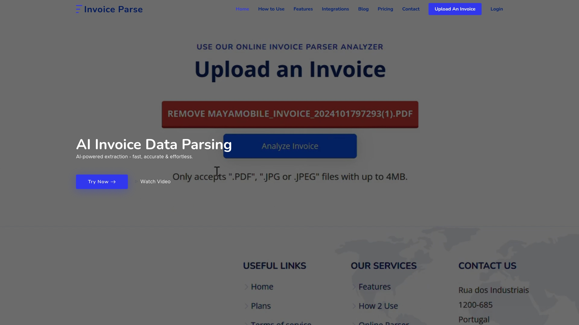
Experience a smarter way to visualize invoices. Invoice Parse automates the extraction of key invoice details into structured formats ready for powerful dashboards and easy-to-read charts. Upload PDFs or images with a simple drag and drop. Get instant, accurate data you can send directly to Power BI, Excel, or your favorite reporting tool. If you want to see your invoice payment patterns in real time, learn how our dashboard solutions bring clarity to your financial reporting.
Stop wasting hours wrangling raw invoice data. Visit Invoice Parse to explore how effortless, error-free data extraction can supercharge the 7 visualization tips you just learned. Try it today and be the first in your industry to turn invoice chaos into visual clarity.
Frequently Asked Questions
What is invoice data visualization?
Invoice data visualization is the process of converting raw financial data into graphical representations, making it easier for businesses to interpret financial patterns, trends, and performance metrics.
Why is data visualization important for finance professionals?
Data visualization is crucial for finance professionals as it enables rapid pattern recognition, enhances decision-making, and simplifies complex financial information, allowing for more informed strategic decisions.
How do I choose the right visualization tools for invoice data?
To choose the right visualization tools, consider factors such as compatibility with existing systems, scalability, user interface, and the ability to provide various visualization types for clearer data interpretation.
What are some effective types of graphs for presenting invoice data?
Effective types of graphs for presenting invoice data include bar charts, line graphs, pie charts, and heat maps; these familiar formats help convey information in a clear, intuitive manner.
Recommended
- AI Invoice Parse – Understanding Data Visualization in Finance for Growth
- AI Invoice Parse – Invoice Dashboard Guide: How to Streamline Billing in 2025
- AI Invoice Parse – Invoice Use Guide: Best Practices and Tips for 2025
- AI Invoice Parse – The Ultimate Guide to Invoice Line for Beginners (2025)
- 2025 Guide to Insurance Analytics: Transform Your Decisions - Digital Insurance Platform | IBSuite Insurance Software | Modern Insurance System